Fifth Tribe Labs, started in 2015, is an initiative aimed to encourage and support all Fifth Tribe employees to pursue a side project outside of client works as a way to hone their skills and broaden their horizons. Many exciting ideas were born from the labs. Ask Anything is one of those ideas. This series of articles takes you through the process of how this app evolved in multiple aspects including product features, UX and visual design.
This is the second article of its series. If you haven’t read about the previous phase, check it out here.
Ask Anything 2.0
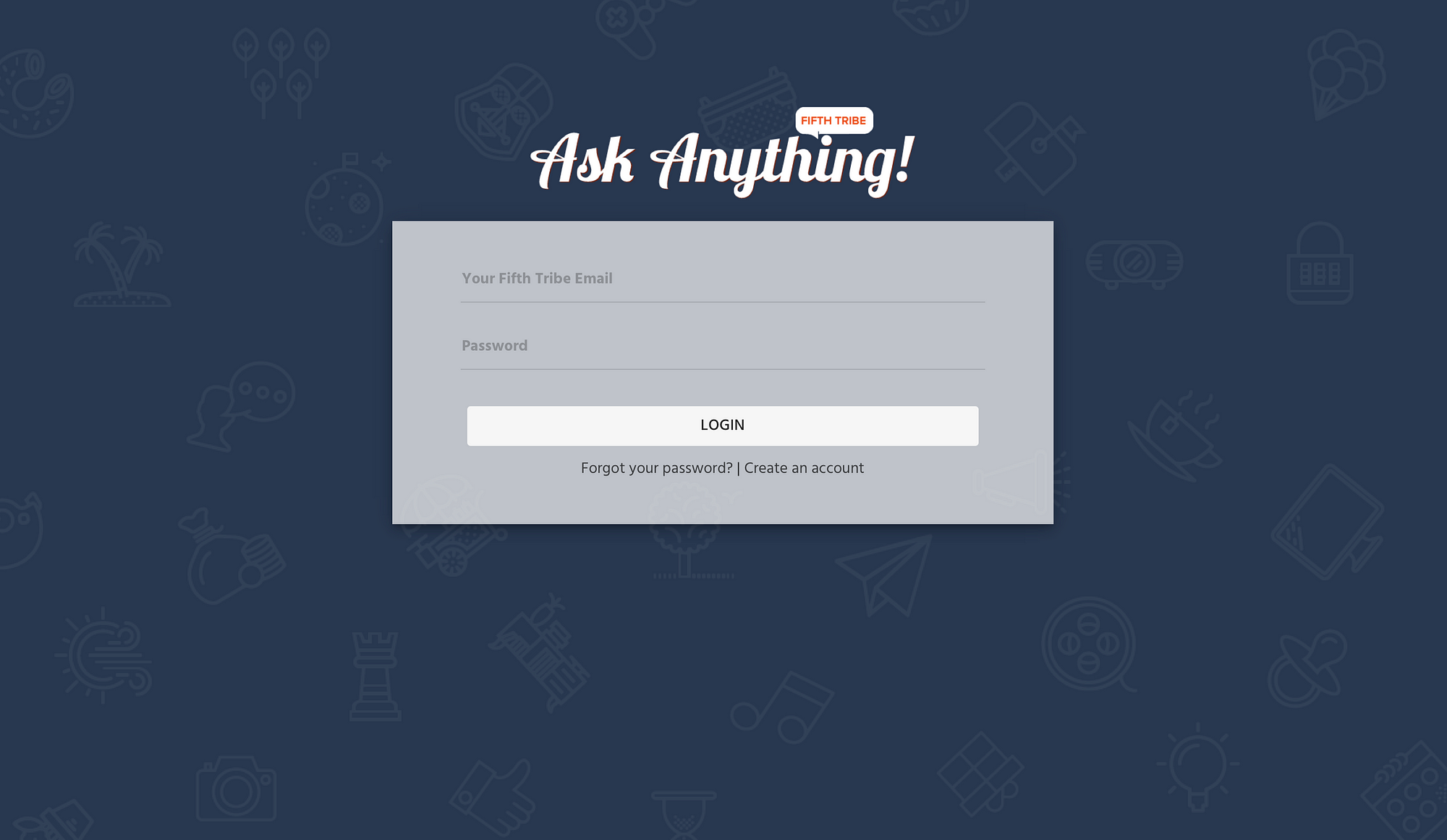
For this second version, I decided to tone down the color scheme. The red on white theme is good for branding but for this app, it’s a little too intense in aiding the users looking for the content they want. However, I still kept the icon pattern background to maintain a fun tone.

It wasn’t until 2.0 that I was actually able to get the user authentication working. At the moment, it runs using Firebase’s built-in email/password data structure. To store more user data than just email and password, I would have to get a Google App account to link with Firebase and take advantage of their user authentication ability. It will allow users to log in using their gmail account. But for prototyping purpose, whatever comes with Firebase does the job just fine.
Feedback from the 1.0 version was that there needed to be a better way to display, archive and sort content. As a result, an important feature was added which is “topics”.

Topics works like a tag attached to each question. Whenever a user types something in the topic input, a function loops through a topic object stored in Firebase and makes suggestions. If the user enters a topic that does not exist, when the answer is submitted it will get stored as a new value in the topic object.

The addition of the topic feature led to the need of a navigation menu so that users can easily click on a topic and look at previously asked questions. This navigation component also led to an entire overhaul of the layout. I could have possibly kept the top-down layout as is and add navigation at the top. However, I realized that eventually if my app grows with more functionality — which I hope it won’t because I’m still obsessed with the MVP idea — the top navigation will become crowded. Also, having navigation at the top suggests “multiple pages”, which is not what I intended for the user to feel. With all that being considered, I created a side navigation, which gives me more room to experiment with, and moved the search form to the top.
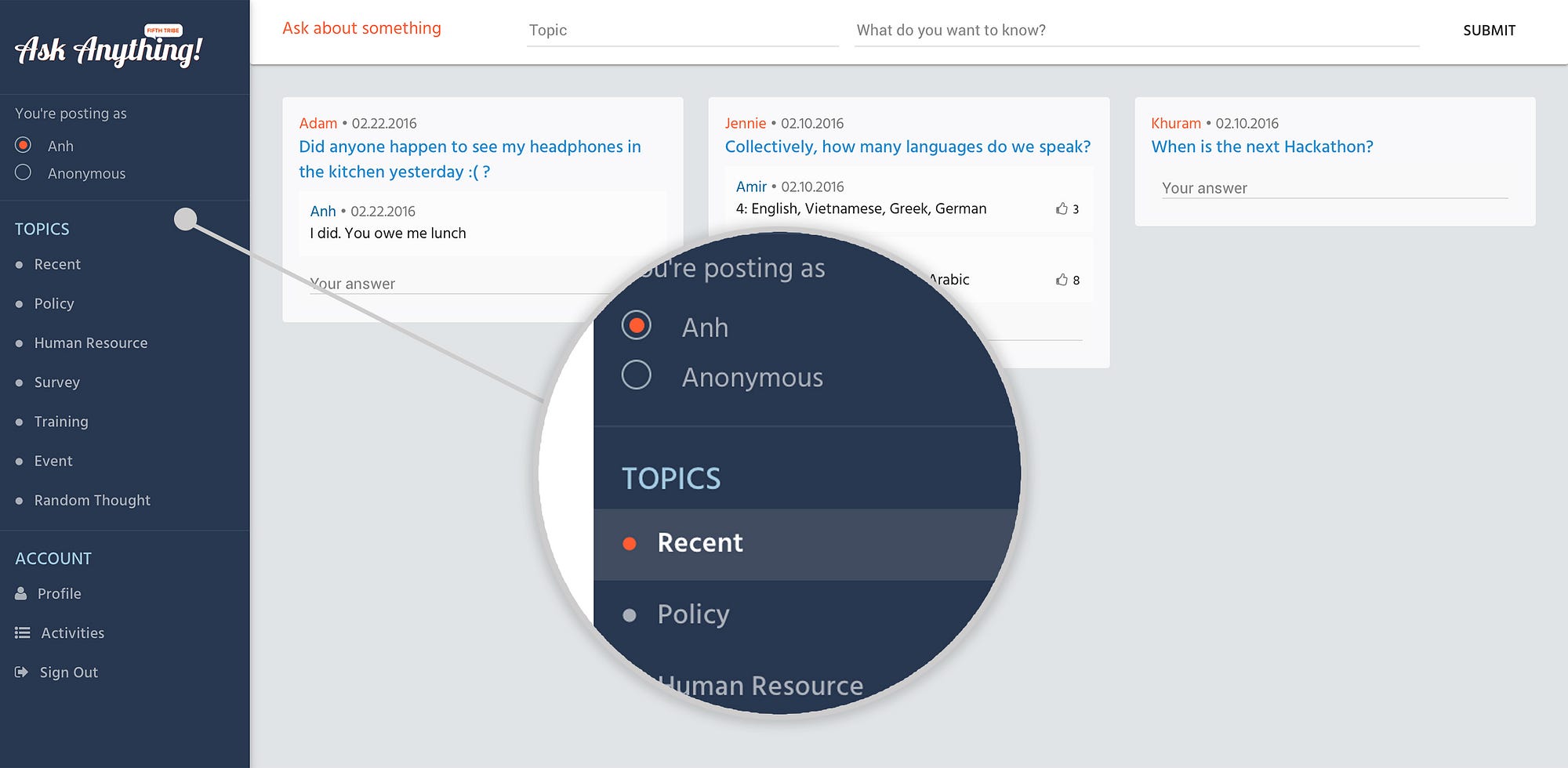
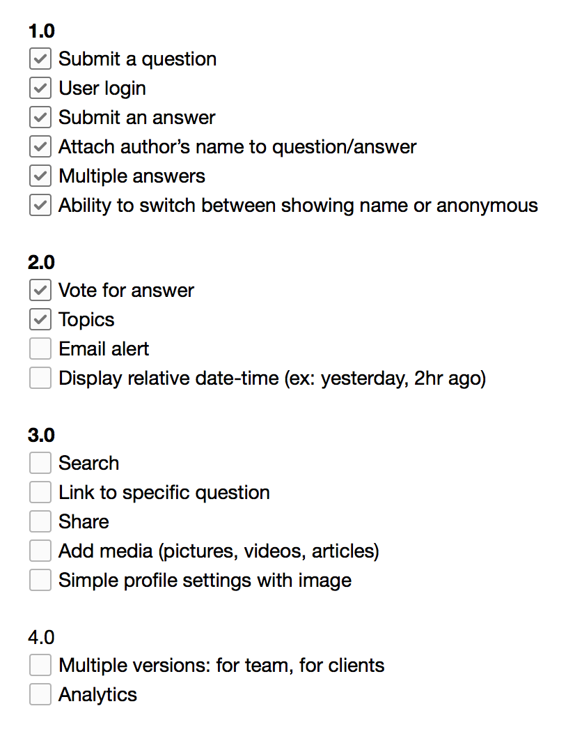
Checking back in on development, here is my progress so far:
Also, here’s a snapshot of how my data is structured on Firebase (leave a comment if you want an explanation of the data tree):

At this stage, the app was ready for another test drive.
In the second feedback round, usability was on the right track for further development. Adding topics had proven to be helpful, however, there is one important piece of feedback that once again challenges the design of this version.
The feedback was that the excitement upon seeing Ask Anything has gone. It’s too much like an “app”, meaning that this version makes users feel like it’s just another communication tool in their workflow besides Slack, Basecamp… which wasn’t exactly what we were aiming for. Ask Anything is meant to be a company’s digital open-area, where everyone gets to know more about each other and the community they work in. It needs that fun, emotive facet. Ask Anything 1.0 was on the path of doing that, but that aspect has lost in this iteration.
The question now is how do we maintain an intuitive user experience but also make it fun?
