Over time, there has been a steady increase in the senior population (aged 65 and up), and this group is expected to make up 20.6% of the United States’ population by 2030. Technology use amongst seniors is also directly correlated to this rise in population numbers. For instance, according to the Pew Research Center, around four-in-ten (42%) senior adults owned smartphones in 2016 (up from just 18% in 2013) and 67% of them used the Internet; these numbers have only risen since then. Therefore, by overlooking this older demographic – whether deliberately or unintentionally -, companies are not only missing out on a large user base, but they are also excluding users from experiencing their product.
Designing technology for seniors might be easier said than done, however. Although many seniors can surprisingly be much savvier than we expect them to be (shoutout, Grandma!), the habits and lifestyles of this demographic are starkly different from the younger, iPhone-glued-to-hand Tweeters and Instagrammers amongst us. Through examining the most prominent usability concerns amongst seniors, we will be able to optimize this group’s user experience, which will ultimately lead to fewer questions and less confusion. Therefore, in this piece I will be primarily focusing on how to improve digital strategies to focus on functionality, design, and adoption for seniors.
Creating Senior-Friendly Digital Products
When designing technology for seniors, it’s a mistake to think in terms of age rather than ability. Age is just a number, and people age differently; for example, someone who is 85 years old might be much more capable than his/her 70 year old counterpart. This piece on UI Design for Seniors explores other factors to consider rather than age – such as vision, hearing, movement control, and device bias – that could impact a senior’s ability to use a technology product; the article also offers helpful mitigation strategies to help make your product more useful to older populations.
In addition to the usability tips offered in the article above by eldertech.org, I will offer a few general considerations to keep in mind for designing both websites and applications for seniors:
1) Prioritize Readability
The first thing I think of when it comes to the senior digital experience is readability. When creating interfaces for an older demographic, it’s important to keep in mind that vision weakens with age. Some seniors also suffer from color blindness, which inhibits their ability to distinguish between certain colors; here is a resource for designing colorblind-friendly websites. Additionally, text should be clearly identifiable through the use of consistent stroke weights (e.g. Serif & Sans Serif fonts), readable font sizes (18-20 pixels on mobile devices and no smaller than 16 pixels on computers), and contrasting colors. Soft pastels for background colors and dark colors for text are effective design principles.
Additional tip! Consider making text sizes adjustable (especially on mobile devices) to make the user experience customizable and to ensure that all users are able to comfortably engage with you product.

Effective vs. ineffective color choices to promote readability. Source: Why Color Blindness is No Longer a Problem for Web Design, Alex Bulat.
2) Incorporate Disability-Friendly Functions
Considering that some seniors may suffer from vision or hearing loss, your product should be disability-friendly. Ensuring that users will be able to use your product easily even if they are hard of hearing or seeing is another means of improving the senior user experience. For example, you can incorporate subtitles on videos and audio content and offer a speech function for those who prefer to listen to content rather than read. Amazon Polly is a popular software to incorporate speech-enabled technology into your product.
3) Facilitate Smooth Navigation
Navigating from point A to point B should be as easy as possible. Crowded spaces and pages on websites and apps can be overwhelming, especially for older users who are just looking for the “must-know” information. Emily Grace Adiseshiah explores how navigation intersects with memory in her piece, UX Design Thinking From A Senior Citizen’s Perspective: “When it comes to senior citizens, the UI navigation system needs to be even more straightforward to facilitate the user journey. Why? Because although our long-term, procedural memory (remembering how to do things) remains largely unchanged as we age, our attention spans tend to get shorter. and short-term, episodic memory tends to suffer. This means that our ability to learn new concepts, such as interacting with a new interface for the mature generations, has its limitations.” Therefore, navigation patterns and icons should be basic, like horizontal menu bars that show all options at once or breadcrumbs that guide users to and from specific locations in as few clicks as possible; check out this article on the most Effective Guidelines for Breadcrumb Usability and SEO. The simpler, the better!

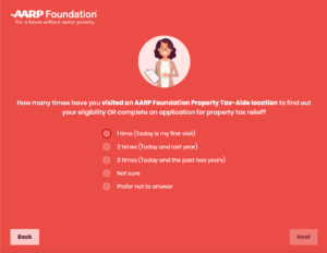
With only 2 navigation options (next & back), the user journey through the application is easy. Source: AARP Foundation Property Tax Aide Program tool, created by Fifth Tribe.
If you are designing a mobile application for seniors, consider these next 3 tips:
4) Fill a Need
If you are considering building a senior-friendly application, or you are looking to make your product more inclusive, your very first step should be to identify a need and gap in the market. What older generations need and want can be drastically oppositional to the priorities of younger users. Consider what type of well-designed platform the senior crowd would use: a product that will allow them to easily share images, videos, and updates with family members? A portal that organizes their health information? A platform that helps them access and understand their senior benefits? All of these ideas address a very specific need in the senior market.
5) Label Icons
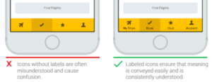
Especially on a smaller device like a phone or tablet where screens are smaller, labeled icons can help to avoid confusion. Considering that older users might not recognize the meanings of undefined symbols (like the Share button), textual labels can help facilitate a smoother user experience.

Unlabeled icons vs. labeled icons. Source: Icons As Part Of A Great User Experience, Nick Babich.
6) Outline Application Instructions
Finally (and maybe most importantly!), you should provide clear instructions on how to use the application! If you keep in mind that mobile applications are likely new concepts to many older adults, a clear introduction to the app and how to use and navigate it will clarify some digital mysteries. My grandfather shared that although he’s tried to download and use some apps that have been recommended to him, oftentimes he can’t figure out how to use them. He told me that this experience is always frustrating and that it discourages him from opening up the app again. He shared that a simple, step-by-step guide to using the app would have likely resolved his confusion.
When creating an online interface that is usable and accessible for seniors, there are 3 primary factors that you should keep in mind:
7) Minimize Clicks and Scrolls
For those with diminishing motor skills, lower levels of coordination/navigation that are required to follow links. Consequently, UI elements should be big enough (at least 11 mm diagonally) and far enough apart from each other (at least 2 mm), according Ollie Campbell on Smashing Magazine. Similarly, minimize the amount of clicks that are necessary and, if possible, avoid double-clicking features. Finally, avoid scrolling wherever possible because the scrollbar can cause accessibility challenges for users with motor skill impairment. For users who have trouble reading, scrolling can affect their experience because they are constantly having to reacquire their position in the text after it moves. If a scrollbar is required to navigate, keep them simple in their look and feel, and give users options to use them (e.g. clicking on the scrollbar arrows, clicking within the draggable portion of the page itself, dragging the slider, using the scroll wheel on their mouse, or using the arrow keys on their keyboard) (Adiseshiah, Usability Geek).
8) Implement Descriptive Links
This Accessibility Cheat Sheet explores multiple different avenues for increasing accessibility for seniors on websites. Though all of the information is helpful, one of the most unique tips that I discovered related to making links descriptive. Links should be distinct in color and should be underlined as well – not just one or the other. “Click here” and “follow this link” are not informative enough, especially for senior readers. Make the linked destination clear and detailed.

Source: Brightspace Accessibility Tip: Descriptive Links, Janice Florent.
9) Create Space
Especially on websites, white space and subheadings should be utilized. Information should be broken into short sections, separated by white space and detailed, large subheadings.
So You’re Ready to Launch…
10) User Test
Once you have designed your product – whether that be a website or an app – it’s time to tackle the most important step in designing technology for seniors: user testing! My 10th tip is to test your products with real users to see how they interact with it. We did extensive user testing with seniors before launching the tool that we built for seniors for AARP Foundation Tax-Aide; this testing revealed user challenges that could not have been predicted and we were able to resolve them before the tool went live (CHECK OUT THE TOOL IN ACTION!). You can also use a prototyping tool, like Justinmind, to stimulate your design and see how your users are interacting with it in real time.

User testing the AARP Property Tax-Aide Program tool.
AARP Foundation Tax-Aide tool featured on WXYZ-DET (ABC)
When creating a website or application for seniors, your top priorities should be functionality, design, and adoption. Refer to these 10 tips to ensure that whatever you create promotes a fluid and positive user experience – regardless of age!

