I’m a fan of icons. Some might argue that using icons is no longer a trend but for me it’s about staying in control of the medium and resources that you need for every design project. Icons undeniably still serve well in helping users navigate with ease. On top of that, it adds emotion to a digital product. Designers can express their style and how they want users to feel about their product through icons. In design, nothing really gets old if it’s used right.
Here are some rules of thumb when using icons:
- Avoid using icons as is. Even with the most stylistic set you should still modify them to fit your project or personal style.
- Consistency check. Always make sure the icon set you choose speaks the same language as your typography and graphic choices. Consider what the appropriate tone is. Minimal, simplified icons are adaptive to any design but sometimes may appear soulless. Stylistic and detailed icons used right will greatly enhance your design but in some cases they take more attention then they need to.
- Constantly ask how many do you actually need? And the answer is always less is more. Consider icon placement, visual balance and content density. An example of bad icon usage is when they are use for a long list of categories or buttons. The minute you have more than 5 icons to represent choices, users have a hard time figure out what they are or remembering them.
- Purpose. Always know what the particular functions of icons are in your project. Are they for navigation, decoration or branding? The function can be more than one for icons at a particular placement. However make sure you don’t use icons for more than one area with different purposes. Or in other words, don’t abuse them.
- Don’t just stick with free icons. Designers invest in fonts, it’s also worth it to invest in icons. A high quality icon set gives you more modification options and ease of use.
Icon Apps
These apps allow you to “drag an drop” icons onto your working project without having to go to your web browser and download. Also, they cut out the pain of having to search through files of icons.
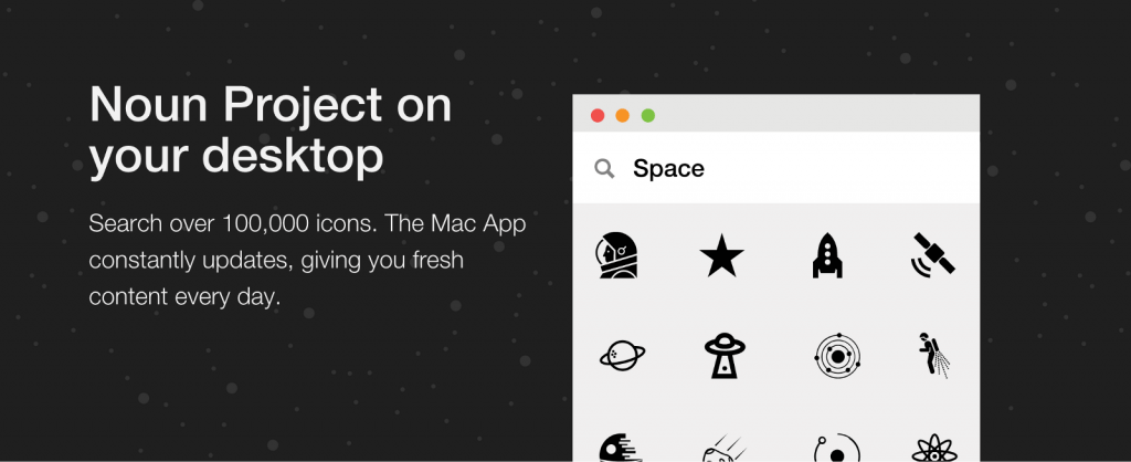
NounPro from the Noun Project
This app gives you the most variety since the icons come from different designers. However, the monthly subscription of $9.99 won’t make much sense if you don’t use icons on a regular basis. If that is the case you can go with their original web version. It might be less efficient but as a free resources it’s still great.
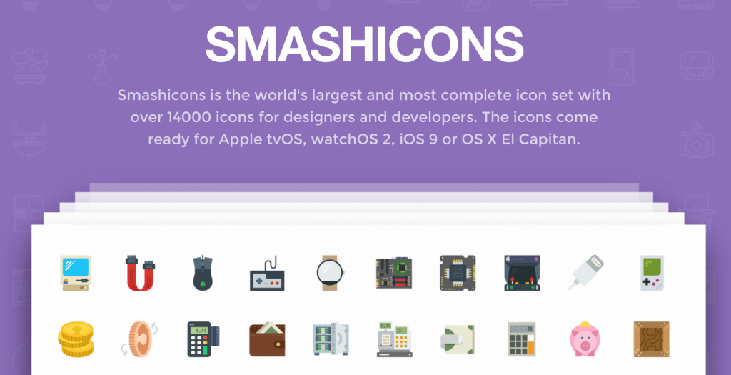
Smash Icons
Each icons in this set comes in solid, outline and detail color styles. Aside from UI, they can be constructed into infographics or small illustrations.
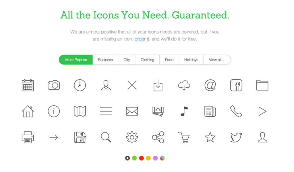
Icons8
I’m not crazy about the icon design and variation of this app for the price of $249, though with the free version, where you can only get png icons, this app is still awesome for design prototyping or keynote presentations.
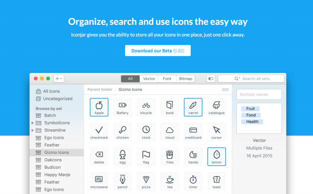
Icon Jar
This is not an icon library itself but a tool to organize all your icon resources which is extremely helpful.
Premium Sets
Most premium sets give you free example packs. The free samples are usually efficient enough to use for apps and webs. If you want to commit to one make sure you preview the entire set and evaluate:
1. When a pack says 5,000 icons, for example, how many are actually unique icons and how many are just slight modifications of the same icon.
2. What is the generic style of the pack, how many categories are included, how often can you use them?
3. How many file formats does it come with?
4. Does it get updated frequently if not at all?
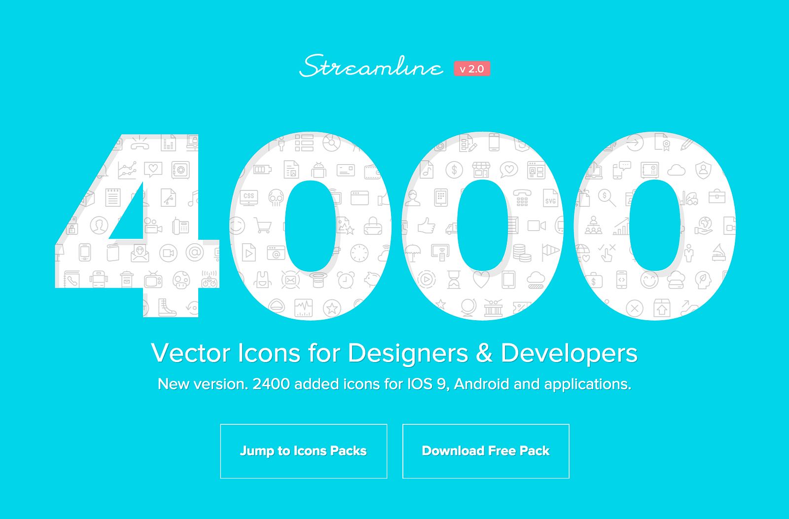
Streamline Icons
NOVA

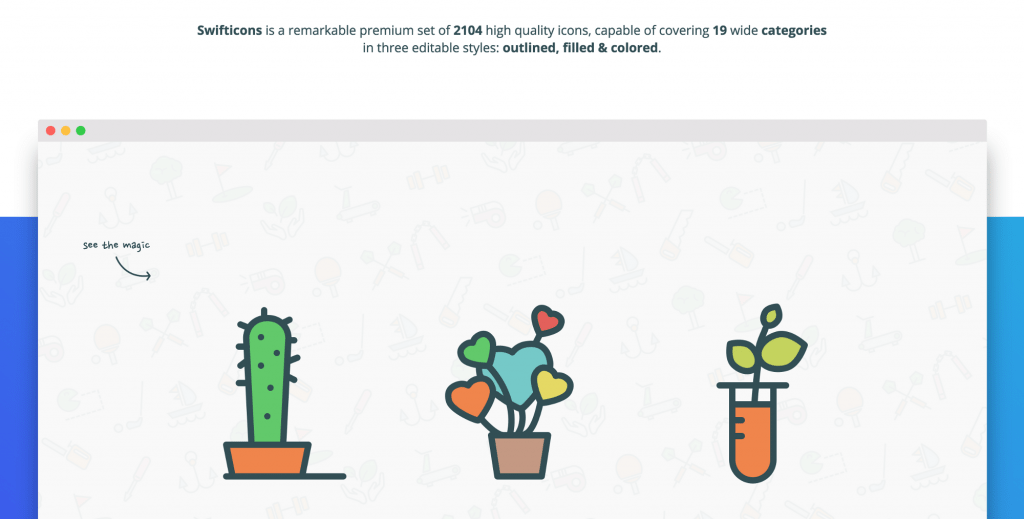
Swift Icons
A free set of 168 icons from this pack can be downloaded here.
The Ultimate Icon Bundle

Stylist Sets
These sets are not as versatile and can only be used for very specific design direction. I don’t see myself using them for UI a lot, though they can be applied to a wider range of projects from infographics and illustrations to animations.
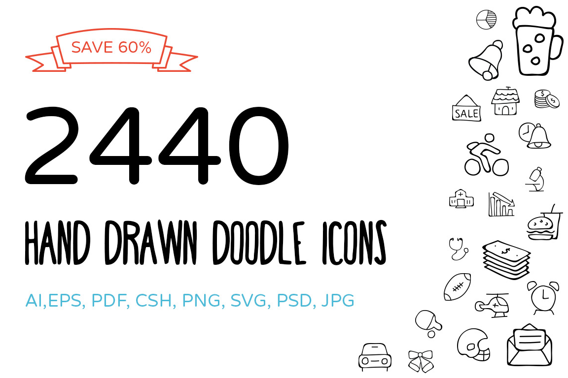
Hand-drawn Icons
Remember those story-telling motion graphics with a hand doodling on paper as the story unfolds? This set might save you tons of time if sketching/drawing is not your special power.
Lil Stories — Weather Icons
This one is my favorite. It’s a small set with small price of $4. I’ve used them to build scenic illustrations for various projects.

Kameleon
Not a fan of their default google material color choice but with some modification this one still a good option for interactive design.

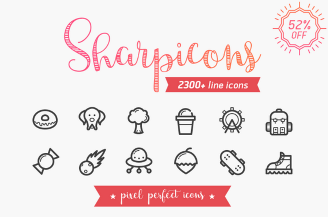
Sharpicons
Icon Fonts
I assume that everyone knows Font Awesome by now so I won’t mention it. If you are not familiar with icon fonts, read about it here. Here is a list of open source icon font libraries similar to Font Awesome.
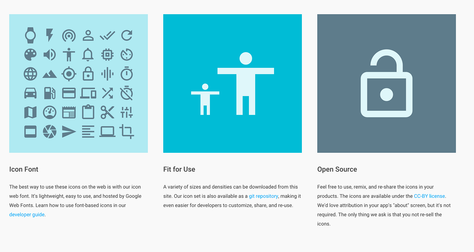
Google Material
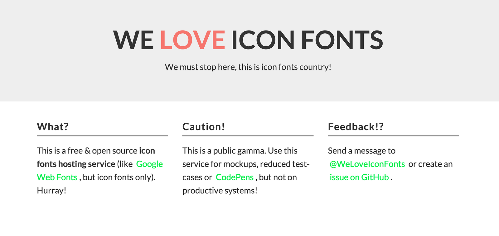
We Love Icon Fonts
Fontello

Fontastic
With this one you can turn your favorite icon set into an icon font.

And that’s all. I hope this helps!

